|
| Vector Portrait |
Thursday, March 31, 2016
Still Drawing and Vectoring!
Hey kids, I have to apologize once again for the delay in posts. I am still working diligently on other projects, some illustrative and others more game design oriented. This is not to mention the freelance gigs I've had of late, but truthfully I really should be uploading the sketches and personal work I've produced. While a good portion of it will go on my new website (I know I redesigned it again recently but adobe put out another update to muse and I really want to play with it again), most of it will be posted here first. To that goal here is the first in the new batch, a vector portrait. A while ago I saw a vector portrait by one of my graphic design compatriots. I've worked in 3d before and thought it would be a fun challenge to do all in 2d. Fun stuff, but to be honest I don't know that I am 100% there yet on this piece. I might still push a few more pixels around but in the meantime here's what I have so far:

Wednesday, November 25, 2015
Fireboy
So, for the first time in ages Seattle has been chilly enough to allow us to light a fire in the fireplace. Due to our rental agreement we are only permitted to use the Duraflame type logs. Sadly I am cheap and as a result I invested in a few of the store brand un-logs.
Funnily enough these seem to burn a little longer. Like so many generic versions of things this appears to come at a bit of a price. While the burn time is stretched out, the initial stages are more often than not just the two ends burning for about an hour. It looks weird. My lovely wife requested I make a character out of it. This while a bit odd, did turn out quite cute. I post it here for you, Fireboy:

Honestly, now that I think about it, he might make for a fun game idea...Stay tuned :)
Funnily enough these seem to burn a little longer. Like so many generic versions of things this appears to come at a bit of a price. While the burn time is stretched out, the initial stages are more often than not just the two ends burning for about an hour. It looks weird. My lovely wife requested I make a character out of it. This while a bit odd, did turn out quite cute. I post it here for you, Fireboy:

Honestly, now that I think about it, he might make for a fun game idea...Stay tuned :)
Tuesday, November 10, 2015
Updating again at last!
Hey there!
So it has been a while since my last update here, I know I know, bad form for a blog called "Sketch Every Day". I have actually been employed at a telecom developing elearning courses this year and it ate up a good amount of my creative energies. Honestly I loved the job. It was a great chance to push good design in a framework of interactivity as well as an opportunity to formalize a lot of the tutorial and training skills I have gathered over the teams I worked on in my previous contracts.
Sadly for the time being that contract ended. I hope another opportunity on that team opens up again soon, but in the meantime I am again on the grind looking for new design opportunities. This made me realize it had been some time since I've done an overhaul on my portfolio site. At the time the current design was nice and clean, but I felt like I had to compromise a bit and use a few of my older pieces for the portfolio. I resolved not to put my next version up until I had updated them as well as adding some of my new work. This means for the moment I am prioritizing new pieces and adding more fun stuff to the site.
Until it goes live I'll start posting new work here as a stop gap. I can't wait to get some more work done, here is the first in the next wave. It's an updated Deep One mainly using a Dunkleosteus as inspiration. It was great fun to dive back into photoshop painting as my work lately has been mainly vector based. More to come, I promise!

So it has been a while since my last update here, I know I know, bad form for a blog called "Sketch Every Day". I have actually been employed at a telecom developing elearning courses this year and it ate up a good amount of my creative energies. Honestly I loved the job. It was a great chance to push good design in a framework of interactivity as well as an opportunity to formalize a lot of the tutorial and training skills I have gathered over the teams I worked on in my previous contracts.
Sadly for the time being that contract ended. I hope another opportunity on that team opens up again soon, but in the meantime I am again on the grind looking for new design opportunities. This made me realize it had been some time since I've done an overhaul on my portfolio site. At the time the current design was nice and clean, but I felt like I had to compromise a bit and use a few of my older pieces for the portfolio. I resolved not to put my next version up until I had updated them as well as adding some of my new work. This means for the moment I am prioritizing new pieces and adding more fun stuff to the site.
Until it goes live I'll start posting new work here as a stop gap. I can't wait to get some more work done, here is the first in the next wave. It's an updated Deep One mainly using a Dunkleosteus as inspiration. It was great fun to dive back into photoshop painting as my work lately has been mainly vector based. More to come, I promise!

Saturday, June 20, 2015
H.P.Lovable Watercolors
As I mentioned in the previous post I worked some watercolors up for the H.P.Lovable designs. I really like how most of them came out. I think some might actually be worth putting on a t-shirt if I can find a decent service. I'll be sure to post about it if I do but for now, here are the finals so far.
Apologies for the baby-ized English, I'll probably change this on the final versions, except for the Cthulhu quote (that one I like).


Apologies for the baby-ized English, I'll probably change this on the final versions, except for the Cthulhu quote (that one I like).

Cthulhu
"In his house at R'lyeh dead Cthulhu waits dweaming."

Mi-go
"Remember, that dawk world of fungoid gawdens an' windowwess cities isn't weawy terwible."

Deep One
"In that laiw of the Deep Ones we shaow dwell amidst wondewr an' glowry fowevewr."

Old One
"Radiates, vegetabews, monstwostities, staw-spawn-whateverw they had been, they werwe men!"

Ghoul
"Can you fancy a squatting of namewess dog-wike things in a chawchyawd teaching a smawl chiwd how to feed wike themsewves?"
H.P.Lovable
Saw some incredibly crazy cute drawings some time ago and thought, hey why not take some Mythos creatures and cute them up a bit. To be honest I didn't come up with the name, that was my lovely wife. I think once the series is done I'll throw the designs on some t-shirts if the designs are good enough.

 I finally came up with one that is fairly close to the final design on the bottom left corner, but it looked a little too...I don't know, derpy I guess.


The first one was just a quick once over of the big guy (Cthulhu), a mi-go, and some tests for a Deep One. I always like drawing deep ones and didn't love any of the designs I came up with on the first pass. Per this I decided to fool around and refine it a bit.


I pushed the Cthulhu design a little bit and finalized the deep one. The mi-go seemed solid so I left it as is and tried for an old one and a ghoul. I don't love the ghoul but that's sort of a tough one to crack. I'm not sure why but I felt like the shapes are too irregular. The old one looked ok though.
Another group of refining the design. Cthulhu looks good here as does the deep one. The Ghoul is closer but not completely done but I did include a couple of penguins. If you have read the Mountains of Madness you'll know why :).

This last group was just meant to play with the designs using a more sketchy and heavy brush line. I really love throwing lots of black ink on a page and this was more just to have some fun than anything. I'll post my watercolor results next.
Wednesday, February 5, 2014
"Care To Compete" Logo Design Process
Hey all, it's been a while since my last post. Fear not, I am still drawing everyday, but I have not posted here as most of my projects are in flux at the moment. Also, there are a few I am keeping a bit close to the vest until completion.
In the meantime I would like to show you a little graphic design project I took on recently for a new golf charity business, Care To Compete. When I started, I was given this proposal to go off of:
 This was an interesting design but I thought it could use a bit of work. My client gave me some latitude to play around as long as I maintained the essential parts. These being: two C's, a T as a golf t, and the earth. As you might imagine I had quite a lot of fun pushing vertexes around in illustrator. I wanted to provide a few options for review, some which maintained the original shape and others which I thought kept the essentials but pushed towards a softer and more elegant solution.


In the meantime I would like to show you a little graphic design project I took on recently for a new golf charity business, Care To Compete. When I started, I was given this proposal to go off of:
My clients liked one of the new designs. This was the third from the bottom on the right, but requested a few revisions. These were fairly simple and I provided them with a some options to go with for the final review and changes.The results of the revisions are below.
The notes came back for the final alterations. The requests were: the shading on the globe on 9, the colors on 7, and the shading around the globe on 5 to be applied to the rest of the design. The results were 4 final design options with some minor differences for the client to choose from, shown below:
They decided to go with #1 from the group, which to be honest was my favorite as well.
This was a great project and it was tons of fun to do a little straight graphic design. Sometimes I get so into working on illustration and formatting that I forget how enjoyable it is to jump in and do simple logo designing. I love working with clients to find a design we can both be happy with and the challenges that come with the process. In my next post I'll throw some illustrations up so you can see some of the drawing work I've done lately. Till then I hope you liked looking into the process for this one, see you next time!
Tuesday, July 16, 2013
Deep One Female
Hello again gentle viewer. I have another in-progress piece for you to have a look at. I know it must seem as though I have painted quite a few of these horrid fish-men this year, but please note I come from a very fishy town in Massachusetts. Doing these abominable batrachian monsters often helps me get a feeling for the hometown I rarely get around Seattle. Hmm, I re-read that sentence and on retrospect that could seem like a negative. Trust me I have only love for my birthplace, but anyone from that lovely New England town should be able to admit it's got some fairly fishy overtones. Thanks to a longstanding longing for my town's beaches and a persistent request for art from a certain good chum of mine for use in his card game, I present the next in the fishmen paintings:


She's not done but I figure I should be finished with her by the end of the week. Let me know if you have any suggestions for the background!
Humming Bird UI test
Hello again!
I have had a humming bird game rattling around in my head coming on a few months now. You might recognize the idea from an earlier post: http://sketcheveryday.blogspot.com/2013/04/humming-bird-vector-character-concepts.html . I am still quite interested in developing it further so my task last week was to make a fairly simple and stripped down version of the game view-port. I started by drawing a page or so of flowers to obtain some reference and work out the mood. Rather than keep drawing for weeks on end I went ahead and just got down to some quick layout/design work done. This was the result:


First I used illustrator to sketch out a few vector flowers and some assets. Once I had vector flowers as close as I wanted I imported them into PS to add some tones, I think it gave them a bit more of a soft, and happier feeling.

When the tones were where I wanted them I brought in the other assets: a time clock, score toast/label, and life/energy bar.

Once everything was laid out I thought it needed a little something to give it a bit more depth so I threw in a bit of shadow. Overall I'm fairly pleased with where it is at the moment but that just means I now have to design menu screens, items, power-ups and a few level backgrounds. For now, I like where it's going. See you next time!
Tuesday, July 2, 2013
Sketch Dump Day! Now with more goats!
Ok, so it's been a few weeks since my last post. Fear not, I am still getting at least a few sketches out each day and even a concept piece now and then. After my last post here (Goats and Gardens) I found a hitherto unknown love for drawing goats, more specifically their exceptionally odd face structure. I am not sure why I like the lines on these animals faces as much as I do, but this has resulted in a sketch log for the past 1.5 weeks of almost exclusively goats. Today's post is a cross section of that log.
I've taken the pages, pared down the ones I was least pleased with, and condensed the remaining into three pages. I think it gives a good overview of the week for me; a long somewhat obsessive struggle to understand how the strange animal's faces work. What I need to do is go to the zoo and look at some living goats, maybe get a bit of life drawing in. For now, let's just go with the sketches I have at the moment, shall we?


I've taken the pages, pared down the ones I was least pleased with, and condensed the remaining into three pages. I think it gives a good overview of the week for me; a long somewhat obsessive struggle to understand how the strange animal's faces work. What I need to do is go to the zoo and look at some living goats, maybe get a bit of life drawing in. For now, let's just go with the sketches I have at the moment, shall we?


The crazy thing with these faces is I still have about 3 pages I haven't included. I often find when drawing something like this I should give myself an arbitrary limit, lest it eat up all my sketch time for the week. It's very hard from time to time not to return to familiar lines once you've drawn a face 20 or 30 times. If you don't stop and move onto the next project or sketch, you could easily fill a sketch book within a month. As for my current next project in the queue, this week I should have time enough to finish a painting for a friend as well as maybe post a few more sketches. Until then please enjoy the goats. As a side note, does anyone have any ideas for an icon set? I have become bored with my current graphic design self challenges and would like to to another icon set. Hit me up with any fun or weird concepts that might make for a good group of icons. I'm thinking my next icons should be cutesy but we'll see what strikes my fancy.
Sunday, June 16, 2013
Goats and Gardens
A good friend posted on his facebook feed about wanting to start a landscaping business using goats. I loved the idea and got a bug in my ear to make a little logo for it. For some reason I have wanted to draw a goat for ages and this little project gave me a chance to practice. I'm not sure exactly why I've had this desire to sketch a goat for a while but it sure was fun doing a concept page to figure out which type of goat I liked the most. In the end feel as though this turned out well, although now that I've finished this one I might do a few more later on for fun. For the time being however, this should work.


Sunday, June 9, 2013
The Birds, version 02
So I kept working on adding some more bird silhouettes with additional positions and beak types. Overall I like the result. It's funny how you can come across something that really adds to the design just by taking a break and cruising the internet. I stumbled across a few images that gave me more ideas for the background and the shape the bird flock should take. Once I had all the shapes I wanted I exported a jpeg, pictured below:
 I thought this looked much better overall and the way the red acted with the blues was much more interesting. I wanted to see how the image would look with an overlay of a texture though. To do this I did a quick search for a free stain texture. I found a great one here : Flicker texture. Once I did a quick alteration to make it more solid red the overlay gave me a great idea. Rather than the blue and red I would desaturate the background and overlay the texture on the shapes. The end result is pictured below:


My wife noticed the bloodspot and said it might look a little better without it, in the end I think she was right so I output a version without it. I think a red border works better overall but if I'm super honest I kind of missed the blood drop, so because I couldn't help it:

I think this is as far as I'll take it, maybe next I'll try another short story. The most dangerous game maybe? Or maybe even some H.G.Wells?
Friday, June 7, 2013
The Birds in-progress
I re-read the short story The Birds a few days ago and happened to be making some vector birds for a little design practice. I thought it might be fun to do a book cover for it and gave it a go. I didn't really have the time this week to take it as far as I would have liked but for now I feel alright about it. I'm thinking this weekend might leave me enough time to work it to completion but for the time being, here is the in progress piece.


Used some reference from the old Hitchcock with Tippi Hedren as well as google image search for a bunch of birds I could make vector silhouettes.
Friday, May 31, 2013
Post Apocalypse Merit Badge
Done for an art challenge last week. Finished it off the other day, I'm not 100% done with it, I think it could use a bit more refinement and maybe a little bit more detail... Either way, for now here it is:


Just remember everybody, duck and cover :)
Wednesday, May 29, 2013
quick sketch
I've been a bit down in the dumps the last week or two and have not felt very artsy fartsy. While I've got a project in the works, I don't have a piece ready to show off, a finished looking piece I mean. What I do have is a quick sketch I did while thinking about H.G.Wells. He has this great quote "man had thrust his brother out of the ease and sunshine. And now that brother was coming back changed!". I've always dug that one, anyways here is a quick sketch just to keep this blog moving :).


Wednesday, May 22, 2013
Angel's Dad
A chum of mine asked yesterday if I would draw a picture of his friend's dad as a gift. It was kind of last minute and I was already working on a few things but figured it wouldn't be moving mountains to do a favor for a someone. Due to time constraints, I was only able to get down a very rough sketch done but I'm fairly pleased with the result. I've got some merit badges coming down the line this week but till I have them designed as well as I would like I won't post them here. Here's Angel's dad.


Saturday, May 18, 2013
E Pluribus Unum
****EDIT****So I didn't realize it was armed forces day and for the record this wasn't meant to be a comment on it, sorry if anyone took offense. Carry on.****END OF EDIT****
I've never really tried good old fashioned propaganda so I thought I'd give it a go. Overall I'm happy with the result although it might be a little much... I wanted to get the feel of something painted on an alley wall but I'm not sure it worked in the end. Either way I feel like to much more alteration will push it over the edge, so for now here's the result:

I've never really tried good old fashioned propaganda so I thought I'd give it a go. Overall I'm happy with the result although it might be a little much... I wanted to get the feel of something painted on an alley wall but I'm not sure it worked in the end. Either way I feel like to much more alteration will push it over the edge, so for now here's the result:

Looking at it now I think I might play with the levels a bit more, or at least pull the whites a bit more up, hmm well maybe pull the whites AND reds up. GAH, for now I'll leave it be. That is of course unless anyone has a suggestion or two?
Thursday, May 16, 2013
Holy Family Logo Fix
So many of you may or may not know I'm an atheist, but I was raised catholic. My mom's parish, Holy Family, had a logo that made my heart hurt. Here is that logo:

Now I'm not one to make presumptions about whether or not I should just force my designs on folks but I took some time and cleaned it up/remade it in a way that did in fact, not hurt my heart's design center.


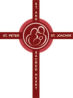


After I sent these off to my Mum, she said her preference was the middle one on the bottom row. As you might imagine I said, "Sounds good, I'll send you a higher res version." and totally did not continue designing... Nah. I sent her the one she wanted and this color version, because I likes me some blue and it felt a bit happier. She responded and asked for a maroon one, as that is the parish color. Now I could have just sent her a color version and said, "All set Mum, I'll call this weekend. Love you.". At this point you know I did not do that. in fact I wanted to fool around with the design a bit more. I finally ended up with a few options I liked.


But my favorite was the last one:

You might ask, and rightly so, why did you stay so close to the original design? Well to be be honest, I wasn't sure how much leeway I had with it, and since I was doing this more just to fix the old design I didn't feel like I really had the right to completely redesign their logo. Welp, that's it kiddo's. Always remember, when a family member sends you an email, don't address the topic in the email, tell them their logo is sad and you're set on fixin' it.
Wednesday, May 15, 2013
Angry Jamie Kilstein Portrait
I had a bee in my bonnet the other day so I painted this up in photoshop. I found a reference online for Jamie Kilstein and used it to make an angry Jamie. He and Allison Kilkenny run the podcast Citizen Radio, a super-mecha-vegan lefty podcast. I don't always agree with them 100%, but I really appreciate what they do. If I had the cash, they are on the list of independent radio shows I want to be able to send some monetary support eventually. Till then I'll just keep makin with the pictures.


Tuesday, May 14, 2013
Orb Weaver Logo Redux
A while back I put together a logo for my wifes blog, Orb Weaver. I liked it at the time but the more i looked at it the more I felt like she deserved better. In service of this I put these together for her:


In the end she liked 6 the best, I agree but I do like the simplicity of 7 too. Thoughts?
Monday, May 13, 2013
Cats of Ulthar pages 9-10
This is the last update on the picture book for a little while, or at least until the next couple of pages are done. Looks like a busy month too so... WOooOOOoo. Anyway, I am pretty please with the way these pages came out and can't wait to continue along with the rest. Till the next update!


Subscribe to:
Posts (Atom)